Login & Signup UX: The 2025 Guide to Best Practices (Examples & Tips)
Optimizing your login and sign-up experience is crucial in 2025. This guide covers UX principles, patterns like passwordless login and passkeys, real-world login screen examples, and a handy checklist to improve conversion and security.
min. read
Last updated:
February 12, 2026
Star us on GitHub and stay updated
Why Focus on Login & Signup UX? The login and registration screens are the gateway to your product – a make-or-break moment in user experience. It’s often said that this is your app’s “front door.” If that door is heavy, creaky, or confusing to open, users drop off. Research shows an overwhelming 88% of users won’t return to a site after a bad UX encounter. And a “bad login experience” is a top culprit – for example, cumbersome password rules or confusing signup flows can drive users away before they even start.
Optimizing your authentication UX isn’t just about making login screens pretty; it directly impacts conversion and retention. Consider that ~10% of active users get stuck in password reset flows each month, and 75% of them quit out of those flows – potentially losing 7.5% of your user base monthly. The cost of poor login UX is real, so it’s worth getting right.
In this guide, we’ll break down the principles and patterns of great login & signup UX in 2025. We’ll look at real-world login screen examples (with illustrations from the Authgear Login Gallery 🌟), cover best practices for forms and error messages, and delve into modern enhancements like passkeys, single sign-on (SSO), and multi-factor auth (MFA). Let’s dive in!
Core Principles of Effective Login & Signup UX
A successful login/signup experience finds the sweet spot between ease-of-use, security, and trust. Keep these core principles in mind:
🔐 Security with Usability: Security measures (password rules, 2FA, etc.) should be balanced with user convenience. Aim for phishing-resistant but frictionless flows. For instance, passkeys can enhance security while simplifying UX by removing passwords. The FIDO Alliance’s new UX guidelines emphasize consistent, easy passkey experiences to boost adoption. Always provide an accessible, easy-to-use, and secure way to log in.
💡 Clarity: Make the process obvious. Label actions clearly (“Create Account” vs “Log In”). If signup and login are separate, keep their pages distinct. If you combine them (e.g. enter email once and the system decides if it’s new or existing), give clear instructions. Users should never be unsure “Am I signing up or logging in right now?”.
⚡ Minimize Cognitive Load: A login form shouldn’t feel like a memory test or a puzzle. Don’t make users recall unnecessary info or solve captchas with blurry images. In fact, new accessibility guidelines (WCAG 2.2) require that logging in not rely on memorization or copying complex characters without alternatives. That means: support password managers and allow paste into password fields, offer “magic link” or social login options, and use WebAuthn/biometrics as a password alternative. Let people login with less mental effort.
🌍 Inclusivity: Design for everyone. Use plain language at a ~Grade 8 reading level; avoid jargon. Ensure the interface works with screen readers and assistive tech (proper HTML tags, ARIA labels, focus states). Color-blind friendly design (high contrast, not relying on color alone for errors) is a must. An accessible login isn’t just ethical, it’s now an expectation – and often legally required.
📱 Mobile-First: Assume many users will sign up or log in on mobile. Use a responsive, mobile-friendly layout. That means big tap targets for buttons, avoiding tiny text, and leveraging mobile features (like SMS autofill, device biometrics, “Scan QR to login on desktop” flows, etc.). For example, if you send a one-time passcode via SMS, design the input to auto-focus and auto-submit when the code is detected from messages (both iOS and Android support OTP autofill – use it to reduce drop-off).
🤝 Trust and Security Signals: The login/signup is where users hand over personal data and set credentials – it’s a trust leap. Use visual cues to show your app is secure: SSL lock icons, a privacy statement link, or even a line like “We’ll never post to your Facebook” near a social login button. Assure users their data is handled safely. Also, be consistent with your branding – a white-labeled, on-brand login screen feels more trustworthy than a generic form that might make users think “Is this really part of the app?”.
📊 Data-Informed Iteration: Continuously monitor metrics like signup conversion rate, login success rate, password reset requests, etc. High drop-off at the signup form? Maybe it’s too long or confusing. Many password reset requests? Maybe your login or password requirements are problematic. Use analytics and user feedback to iterate.
By grounding your design in these principles, you create login and signup flows that feel effortless while still protecting user accounts. Next, let’s explore the common patterns and methods for authentication – and their UX trade-offs – in a handy overview.
Authentication Methods & UX Trade-offs
Users can authenticate in various ways, and each method comes with pros and cons for UX, security, and implementation. The best login UX often means offering the right options for your audience. Here’s a comparison of popular auth methods vs. UX trade-offs:
Auth Method
User Experience Pros
Cons / Trade-offs
Email + Password
Familiar mental model. Works everywhere. Easy to implement. Can pair with password managers.
High friction (remembering/typing). Frequent resets. Error-prone on mobile. Vulnerable to reuse/phishing if not hardened.
Social Login (OAuth)
One-tap signup/login. No new password. Prefills basic profile. Familiar branded buttons build trust.
Privacy concerns for some users. Third-party dependency. Must handle account linking & multi-account edge cases.
Magic Link (Email)
Passwordless; nothing to remember. Works cross-device. Clear mental model: “check your inbox, click to sign in.”
Relies on email deliverability and app switching. Possible delays/spam filtering. Provide resend & alternate paths.
One-Time Passcode (OTP)
Fast on mobile with SMS/Email OTP autofill. No password to create. Good first-run experience.
Waiting for codes can frustrate. SMS has security limits (SIM swap). Needs fallback if code not received.
Phone Number + Password
Phone as familiar identifier. Can combine with OTP verification. Useful in phone-first markets.
Country codes/formatting add friction. Some users avoid sharing numbers. Still inherits password pain.
Passkeys / Biometric (WebAuthn)
One-tap, phishing-resistant login with Face ID/Touch ID/PIN. Nothing to remember. Best-in-class UX + security.
User education needed (“What’s a passkey?”). Initial device setup required. Ensure clear fallbacks for unsupported devices.
Enterprise SSO (SAML/OIDC)
Seamless for B2B users; centralizes security and policies. No extra credentials to manage.
Only relevant to org users. Setup/IT coordination required. Redirects can be jarring if not well messaged.
MFA (add-on factor)
Major security uplift. Builds trust for high-risk accounts. Options include TOTP, push, WebAuthn, SMS.
Extra step = extra friction. Risk of lockouts without backups. Mitigate with “remember device” and multiple methods.
Choosing the right methods: Know your users and risk profile. A consumer app might offer social logins and passkeys for convenience, while an enterprise SaaS product might prioritize SSO and MFA for security. It’s common now to offer multiple login options side-by-side – e.g. email/password or “Continue with Google” or “Login with phone”. This lets users pick what they prefer. Just be sure to also provide a unified experience: no matter which method, the flow should feel consistent and the design should match your brand.
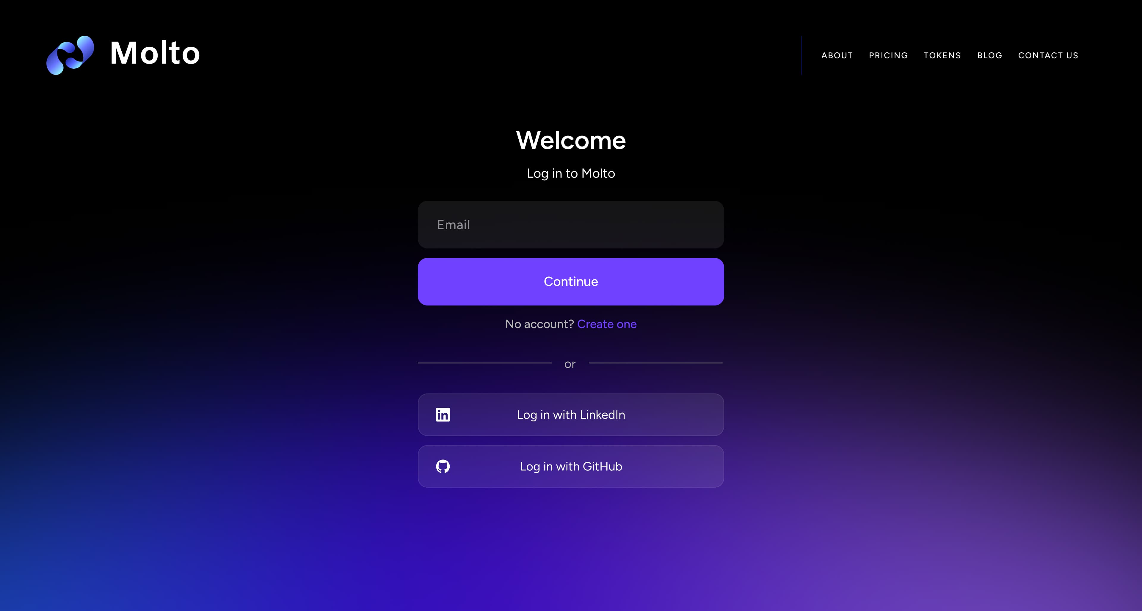
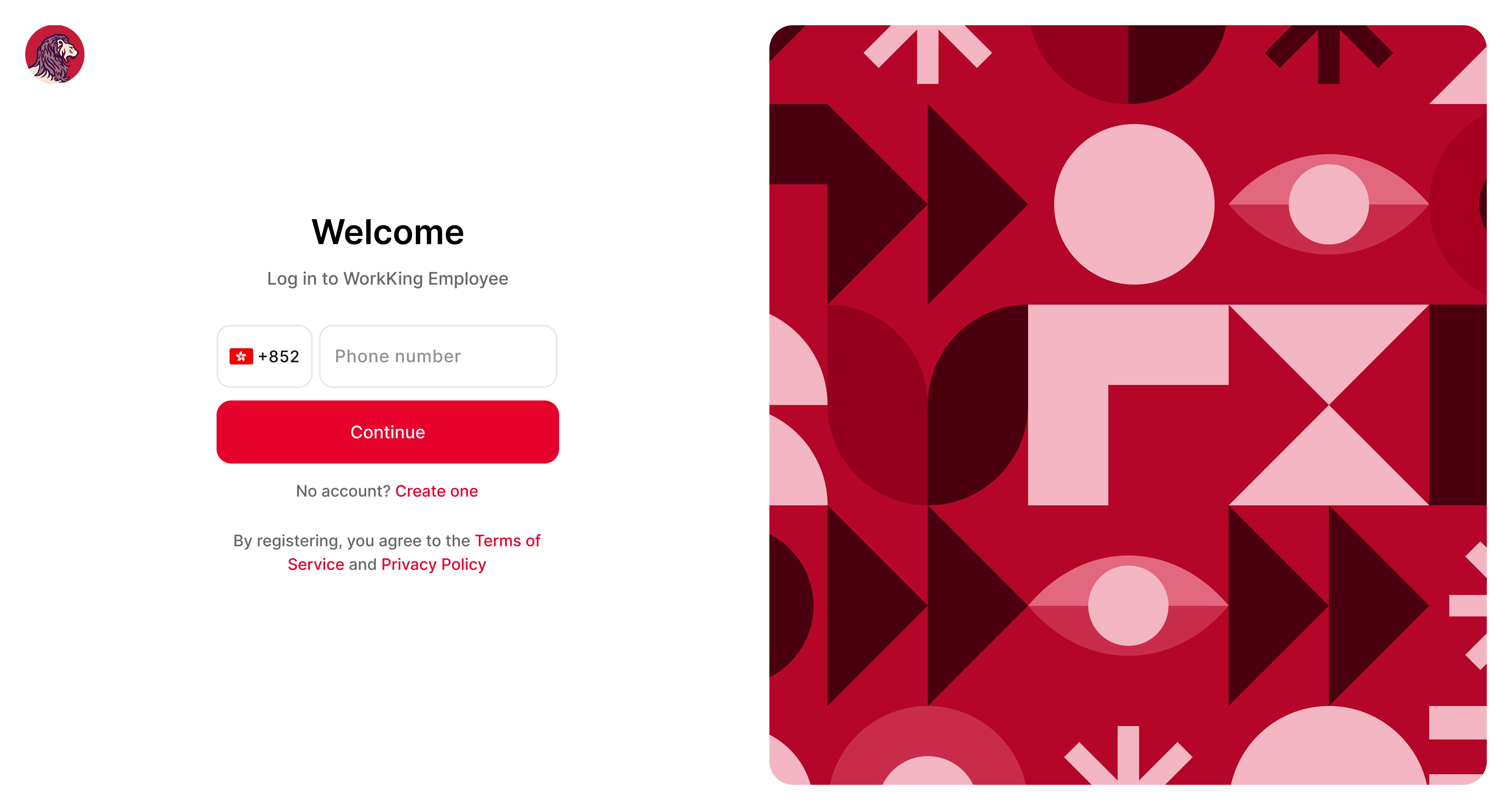
For instance, Authgear’s Login Gallery showcases real apps with multi-option logins. Many modern apps combine methods: e.g., Molto (a developer analytics SaaS) allows email/password, email magic links, social logins, and even passcodes – covering both convenience and security for different user preferences. On the other hand, an app like WorkKing (job platform) went fully passwordless with phone number OTP for simplicity in a mobile-first audience. Both approaches can work if aligned with user needs.
Molto - a developer analytics SaaS
Workking - a job platform
Finally, remember not to overwhelm with too many options on one screen. Offer the key 2–3 methods that make sense for your users. It’s okay to tuck secondary options behind an “Other methods” link or a “More login options” dropdown to keep the UI clean.
Designing a Smooth Sign-Up Flow (UX Best Practices)
The sign-up flow is where a potential user becomes an actual user – every extra field or confusing step here can hurt your conversion. Here’s how to optimize signup UX:
Keep It Simple & Essential
Ask for minimum info upfront: Each additional form field in your signup = more friction. Only ask for what’s truly needed to create the account. Often that’s just an email (or phone) and a password. You can collect profile details later in the user’s account settings or via on-boarding steps. Long forms scare people off – one study found reducing form fields from 9 to 6 increased sign-ups by 25% (hypothetical example, but illustrative of the impact).
Name vs. Username: Unless your app needs a public-facing username, don’t ask users to create one. Using an email as the login identifier is simpler – people won’t forget it. If you want a display name, you can derive it from their email or ask for name optionally.
Avoid redundant fields: Don’t make users type information twice. Common offender: “Confirm Password” field. This often hurts more than it helps, as users may get errors if the two entries don’t match but not know which one is wrong. A better approach is to provide a “Show Password” toggle so users can verify their input. Only use confirmation for critical inputs like emails (and even then, consider just having a verification step via email instead).
Inline help and validation: If you have password rules or other field requirements, show them upfront and inline. For example, indicate password complexity requirements with a hint and check them in real time. Do not wait until form submission to tell the user “Password must include a number, symbol, 8+ chars, etc.” – that’s frustrating. Use inline validation to confirm when requirements are met (green checkmarks, etc.). This ties into a general rule from Nielsen Norman Group: error messages (or avoidance of errors) should be as specific, visible, and timely as possible.
Social sign-up options: As mentioned, offering a social login for sign-up can hugely streamline the process. Many users prefer “Sign up with Google/Apple/Facebook” to avoid filling another form. It can also auto-verify their email. Ensure you follow the platform’s branding guidelines for the buttons (Google’s button guidelines, etc., for familiarity). Also, reassure what data you’ll get (users often worry “will you post on my behalf?” so a small note “(We only get your name and email)” can help).
Split into steps if necessary: If you must ask for a lot (e.g. address, birthday, preferences), consider a multi-step form or wizard. Breaking the signup into a few short screens feels less daunting than one long form. Clearly indicate progress (e.g. “Step 2 of 3”) and save data as you go. This way if a user drops off, you might still capture some info. But try to keep the first step super quick (email/password only) so you at least get the account created – you can collect additional info after account creation (often called progressive profiling).
Allow Sign-Up via Mobile Number: In some markets, users may not have an email or prefer using phone. Allowing phone number sign-up (with an SMS verification) can increase conversion. For example, apps targeting developing regions or non-tech-savvy users often use phone sign-up as the primary method. Just be sure to handle SMS carefully (use OTP autofill to ease the process).
Skip Email Verification (maybe): Waiting for a verification email adds friction. If your risk tolerance allows, consider letting users into the app immediately after sign-up and verify email in the background or later. Many apps now treat unverified emails as a slight limitation (perhaps some features locked) but let the user proceed right after signing up, prompting “Please verify your email”. Immediate access can improve initial conversion, though you’ll want to remind users to verify to prevent spam accounts and ensure you can reach them. On the other hand, for certain domains (finance, enterprise), verification might be mandatory for security reasons – in those cases, convey clearly why you need it and make the verification step as quick as possible.
Welcome and guide new users: After sign-up, don’t just dump users at a login screen again. Log them in straight away and give a friendly welcome message or onboarding tour. The payoff for completing sign-up should be immediate access to value. Also, if you need additional setup (like setting up 2FA, profile info), use in-app prompts or a setup checklist rather than more forms upfront.
Signup Form UI Details
Strong CTAs: Make the “Sign Up” button prominent and clear. If you have both login and signup on the same page (for example, a combined form or a tab interface), highlight the action you expect most new users to take (often “Create Account”). Use a contrasting color for primary actions. The microcopy on the button should read “Sign Up” or “Create Account” – something unambiguous. Avoid just “Continue” if it’s not clear continue with what.
Microcopy for clarity: A short description or headline on the signup page helps. E.g. “Create your account to get started” or “Join [App Name] – it’s free and takes 30 seconds!”. This sets expectations. If you offer social logins, label them clearly (“Sign up with Facebook”) and maybe add a line below like “We’ll never post without your permission.” to alleviate privacy concerns.
Error prevention: Use input types to help users avoid errors (type=”email” triggers mobile email keyboard, etc.). If a user chooses a password that doesn’t meet criteria, show the message next to the field immediately. For email field, you can even validate domain format on blur and say “That doesn’t look like a valid email.” These small things prevent frustration later.
GDPR and consents: If you need to include a Terms of Service or privacy consent, keep the text brief. Use a checkbox (“I agree to the Terms and Privacy Policy”) with links to those docs. But don’t overwhelm the sign-up with legalese. Also, consider making newsletter opt-in checkboxes opt-in (unchecked by default) to respect user choices – it’s better UX and builds trust.
Confirmation and next steps: After a successful sign-up, clearly indicate it. A small inline message or redirect to a welcome screen is good. If an email verification is sent, tell the user “Check your inbox to verify your email” and allow continuing in a limited mode or a “Resend email” option if needed. Feedback is important – don’t leave the user wondering if it worked.
Designing a Frictionless Login Experience
For returning users, the login UX should be optimized to get them signed in quickly and confidently. Here are best practices for login flows and UI:
Make Login Quick and Painless
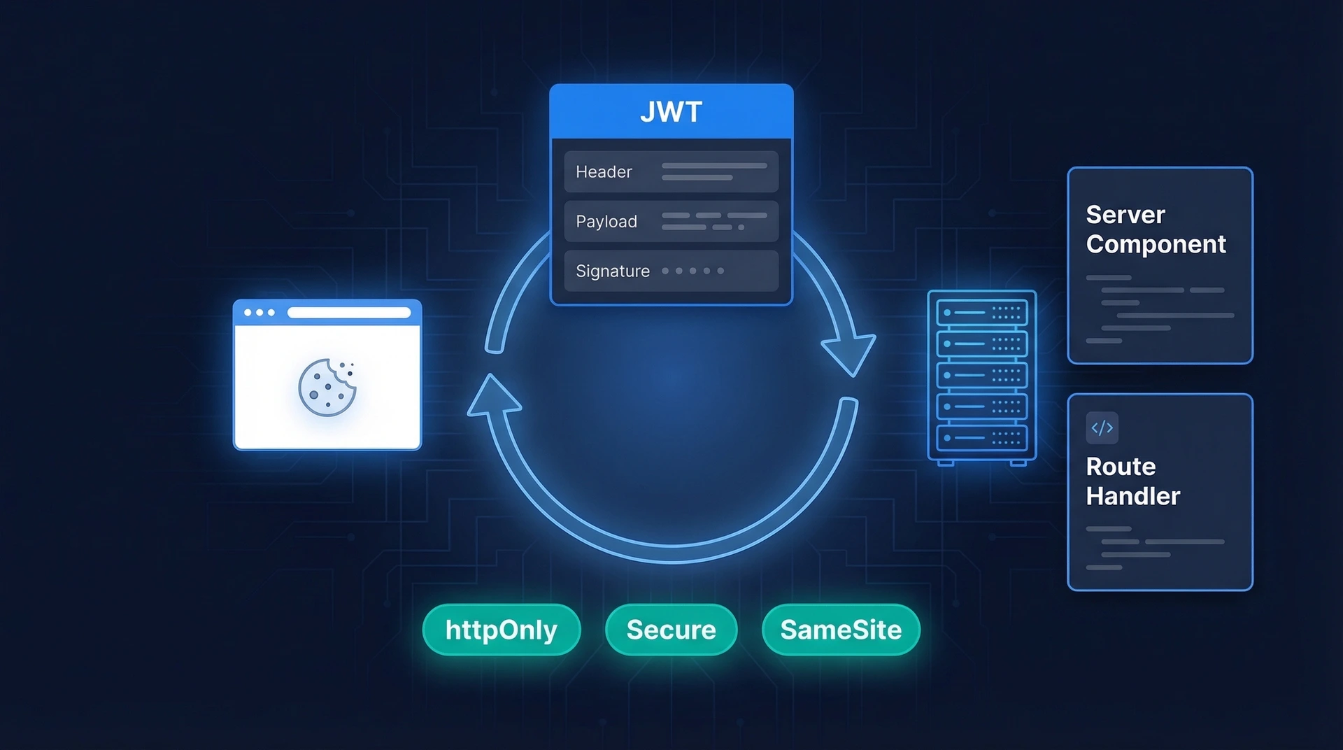
Recognize logged-in state: First off, if the user is already authenticated (has a valid session or token), skip the login screen entirely! Nothing is better than not asking the user to log in at all. Use long-lived sessions with secure cookies or tokens so users stay logged in. When that’s not possible, consider auto-login links in emails (“Magic link” for returning users) or deep links that open the app and sign them in. Many mobile apps use device-based trust – once you log in the first time, subsequent app launches go straight in unless something changed (new device, manual logout, etc.).
Prominent login options: On the login screen, present the most common login method first. If your primary method is email/password, that form should be front and center. If social login is very popular among your users, you might put a “Continue with Google” button at the top. The design should reflect what you want to encourage (e.g., passwordless if reducing password use is a goal).
“Remember me” or device trust: Include a “Keep me signed in” or “Remember this device” checkbox for web login. This sets expectation that the user won’t have to log in every time. On mobile, you can implicitly do this (most apps do not log you out until you explicitly sign out or uninstall). For web, implement it by extending session duration or using refresh tokens. Just be cautious on shared computers – but that’s why it’s a checkbox. When MFA is enabled, “Remember this device for 30 days” greatly improves UX so they aren’t prompted on every login.
Password input UX: If using passwords, polish the basics: allow toggling visibility (eye icon), support copy-paste (don’t disable it – even security orgs like NCSC say let users paste passwords), and utilize the autocomplete="current-password" attribute so browser password managers work seamlessly. Also ensure the username/email field is clearly labeled and supports autocomplete="username". A significant portion of users rely on password managers – good login UX works with them, not against them.
Fast error feedback: If the user enters wrong credentials, show the error instantly after form submission, and do not clear the fields! Keep the email/username pre-filled (assuming that part was correct) so they only have to retype the password. If you can detect which field is wrong, some argue it’s more secure not to specify (to avoid username enumeration), but from a UX perspective telling the user “No account with that email” is helpful if it’s true. A compromise is to always show a generic error on first failure (“Email or password is incorrect”), but after multiple failures, you could hint “Perhaps you don’t have an account? [Sign up]” – gently guiding if it looks like a new user. The key: never lock the user in an error state without an obvious escape (like a reset or signup route).
Account recovery at hand: Make “Forgot password?” easy to find (usually as a link right below the password field). This link should initiate a password reset flow that’s as streamlined as possible: ask for their email or username, send a reset link, let them set a new password and get back in quickly. According to Jared Spool’s research, 75% of users who start a reset drop off before finishing – so we want to improve that. For example, don’t ask security questions or extra info if not needed; one email click and a new password form is enough. Also, include a help link (“Need help logging in?”) on the login page – sometimes users have other issues (like account lockouts or forgot their email). A small FAQ or support contact can save a frustrated user from abandoning.
Speed & Feedback
Loading indicators: If logging in involves any network delay (e.g., calling an API), provide instant feedback – a spinner on the button or a loading bar at top. Users should know the app is attempting login, not just see a disabled form with no feedback. This is especially important for magic link flows (after they click “Send me a link”, show a message “Email sent! Check your inbox.” and perhaps allow them to resend or change email).
Success state: When login is successful, move on quickly but consider a subtle success indicator – even a flash of “Success! Redirecting…” or a checkmark animation can reassure the user (especially if there was a delay). On mobile, a smooth transition from login screen into the app dashboard with maybe a welcome back message can make the experience delightful.
Avoiding common pain points: If your login requires any unusual steps (maybe an OTP every time, or a captcha), think hard if those are necessary. Captchas in particular are a UX hurdle – consider invisible captchas or risk-based triggers (only show if bot suspicion). If you must use them, ensure they are accessible (Google reCAPTCHA has an accessibility mode, etc.) or provide an alternative challenge for users who can’t solve them.
Account Security vs. UX
Sometimes to protect accounts, you need to enforce certain behaviors (like 2FA, strong passwords, etc.). The key is to implement these in a user-friendly way:
Two-Factor Authentication (2FA/MFA): If your app requires 2FA, allow users to choose their 2FA method from a few options – not everyone can receive SMS or wants to use an authenticator app. Common choices: SMS codes, authenticator TOTP codes, push notification approval, or security keys. Provide clear instructions for setup and use plain language (e.g., “Enter the 6-digit code from the Authenticator app”). When a user logs in subsequently, make the 2FA prompt part of the flow in-app (avoid sending them to a blank page). And as noted, let them skip 2FA on trusted devices to reduce annoyance.
Security notifications: A good UX pattern is to notify users of security events (like “New login from Chrome on Windows”). It shows you care about their security and can actually reduce support cases (“Was this you? If not, reset password.”). So consider emails or push notifications for logins from new devices – it’s part of UX too, albeit after the fact.
Rate limiting & lockouts: If a user fails to log in many times, you may temporarily lock or challenge them with a captcha. From a UX perspective, communicate this clearly: e.g., “Too many unsuccessful attempts. Please try again in 5 minutes or reset your password.” Maybe also email them proactively: “We noticed multiple failed login attempts – was this you? If you forgot your password, reset here.” This transparency keeps the user informed rather than just silently blocking them.
Handling Errors & Recovery Gracefully
Even with the best UX, users will stumble – wrong passwords, forgotten credentials, typos – it’s inevitable. How you handle these errors is crucial. A frustrating error experience can cause users to give up, while a helpful one can gently guide them back on track.
Guidelines for UX-Friendly Error Messages
Follow the classic NN/g guidelines for error message UX: be explicit, human, and constructive. In practice, this means:
Clarity: State what went wrong in plain language. (“Invalid password” or “We couldn’t find an account with that email.”) Avoid vague messages like “Login failed” with no context.
Politeness: Use a friendly tone and don’t blame the user. Instead of “You entered the wrong password!”, say “Incorrect password. Please try again.” It’s a subtle shift to avoid making the user feel stupid or at fault.
Precision: If you can pinpoint the issue, do it (without compromising security). E.g., “No account found for that email” helps a user realize they used the wrong email or haven’t signed up. However, some sites intentionally obscure this for security (to prevent account enumeration). Consider the risk – for most consumer apps, the UX benefit of a precise message outweighs the minimal security risk. If in doubt, a generic error is fine on first try, but offer hints on subsequent tries or via a “Need help?” link.
Constructive Advice: Always pair the error with a solution or next step. For instance, “Incorrect password. Reset it here or try again.” The user should never hit a dead-end. If the account is locked, tell them how long until they can retry or how to unlock (“Try again in 5 minutes” or “Contact support to unlock your account”). If a verification code expired, provide a “Resend code” button.
Also, display errors near the field in question when possible. If the user submits a form and something is wrong, highlight the problematic field. E.g., shake the password field or put a red outline with the error message below it. This localizes the problem and reduces the user’s memory load in figuring out what to do.
Error → Recovery Mapping
It’s useful to plan out common error scenarios in your login/signup flows and decide the UX response for each. Here’s a quick mapping of typical errors to recommended recovery actions:
User Error Scenario
Recommended UX Response (Recovery)
Forgot Password
Lead to a streamlined reset flow: prefill known email, send a reset link immediately, show
clear next steps (“Check your inbox”). Offer Resend and log the user in after successful reset.
Incorrect Password
After first failure: inline error near the field (“Incorrect password”). Keep inputs intact.
After multiple failures, surface “Forgot password?” and allow reset without dead-ends.
Unrecognized Email / Username
Gently suggest typos and offer a path to sign up (“No account for this email — Sign up”).
If you avoid enumeration, still keep a visible “Sign up” option.
Account Exists (during Sign Up)
Inform: “Looks like you already have an account.” Switch UI to login with the email prefilled
and provide a “Reset password” link.
Account Not Activated / Email Not Verified
Explain requirement and provide a one-click Resend verification. Allow updating the email
if the address is wrong. Let the user continue in limited mode if policy allows.
Account Locked (too many failed attempts)
State duration (“Locked for 5 minutes”) and why. Offer alternatives: reset password, contact support,
or try another method. Avoid indefinite, unexplained blocks.
Invalid / Expired OTP (MFA or login code)
Inline error: “That code isn’t correct or has expired.” Provide Resend code, a timer to retry,
and an alternative factor (e.g., authenticator app, backup codes).
Expired Reset / Magic Link
Friendly message with a single CTA to generate a fresh link. Preserve context (prefill email) to avoid retyping.
CAPTCHA or Bot Challenge Triggered
Use low-friction or invisible CAPTCHA. If shown, explain why, provide accessible alternatives (audio),
and allow retry without losing form data.
Network / Server Error on Submit
Show non-blaming message (“We’re having trouble connecting”). Provide Retry, graceful
backoff, and status page link if relevant. Never clear user input.
MFA Challenge Failed
Clarify which factor failed; suggest alternatives (use backup codes, switch to SMS/app, approve push).
Offer “Remember this device” after success to reduce future prompts.
Passkey Not Available on Device/Browser
Detect and explain limitation. Offer fallback methods (password, magic link, SMS) and provide guidance
to set up a passkey later in account settings.
By anticipating these cases, you can craft the UX copy and flow to handle them without frustration. Often it’s about providing an immediate next step. For example, if login fails repeatedly, a one-click “Reset password” or “Contact support” link in the error dropdown can turn a negative moment into a more positive one (the user feels taken care of).
Delight with Microcopy & Details
Login and signup flows are a great place to add a touch of personality or reassurance through microcopy. A few examples of small text that can make a difference:
Password Strength Hints: While the user types a new password, show a meter or text like “Strength: Good” or “Add one more character or a symbol to make it stronger.” This guides users proactively.
2FA Prompt Copy: Instead of a bland “Enter code:”, try something a bit more human: “Enter the 6-digit code we sent to your phone ending in 1234.” Or if using an authenticator app: “Open your Authenticator app and enter your verification code.” It’s clear and reassuring.
Success messages: On successful signup, a brief “🎉 Welcome to [AppName]!” can reinforce a positive vibe. On logout, even a “You’ve been logged out. See you again soon!” is nicer than a sterile blank page.
Error humor (cautiously): Some brands inject light humor into error messages (“Wrong password – unless you meant to spell it that way 😜”). This can lighten the mood, but be careful – for something like login, users might be stressed, so humor must be gentle and on-brand. A little empathy goes a long way: e.g., “Passwords are hard! Try again or reset it if you can’t recall.”
Loading states with info: If an action takes a while (like “Setting up your account…” after sign-up), you can display fun or useful tidbits (“Did you know you can connect your Google account later in settings? Just a second while we prepare your dashboard…”). Anything is better than a blank screen.
The goal of microcopy is to communicate that there are people behind the interface who anticipated the user’s situation. This builds trust and can even delight users in an otherwise utilitarian flow.
Ensuring Accessibility in Authentication (A11y Checklist)
An often overlooked aspect of login design is accessibility. But imagine if a visually impaired user can’t log in because the screen reader doesn’t announce an error, or someone with a motor disability can’t focus the “Login” button via keyboard. We must ensure everyone can use the login and signup forms. Here’s a checklist of accessibility best practices for auth flows:
Proper Labels on Inputs: Every form field should have a clear <label> or accessible name. Don’t rely on placeholders alone (those disappear as you type and aren’t read by screen readers when empty). E.g., <label for="email">Email address</label><input id="email" ...>. If you must use floating labels or custom UI, ensure ARIA labels are in place.
Support Autocomplete:Use the appropriate autocomplete attributes (e.g., autocomplete="username" for email/username and autocomplete="current-password" for password). This not only helps sighted users with browser suggestions, but also helps users with cognitive disabilities (who may rely on password managers or browser memory instead of recalling info).
Do Not Disable Paste: As noted earlier, disabling paste on password fields is bad for usability and especially bad for those who use password managers or have mobility issues (who might use copy-paste instead of typing). Let the user paste their password or 2FA code – it’s more accessible and per security experts, it doesn’t actually reduce security to allow this.
Keyboard Navigation: Ensure the user can tab through all elements in a logical order. The focus should go from the first input to the next and to the submit button, etc. No elements (like a fancy social login widget) should trap focus. Also, implement visible focus states (e.g., a thick outline or underline on the field that’s focused) so users who navigate by keyboard know where they are.
Accessible Error Indicators: When an error appears, it should be announced to screen readers. You can achieve this by using an ARIA live region (e.g., a <div role="alert">Incorrect password</div> that updates will be read aloud). Also, link the error message to the field via aria-describedby if it’s specific to that field. Provide sufficient color contrast for error text (WCAG recommends at least 4.5:1 contrast). Use more than just color to indicate errors – e.g., an icon or text – so that color-blind users or those using high contrast mode can detect it.
Alt Text for Images/Icons: If your login screen uses icons (like the little envelope symbol in the email field), ensure they have aria-hidden="true" if purely decorative, or proper alt text if they convey meaning. Any informative graphics (like a QR code login instruction image) should have alternative text describing the essential info.
Timeouts: If your login page has a session timeout or the reset link expires, be careful: WCAG has criteria about giving users enough time. Provide warnings if a form might expire or a login session is about to end, and allow easy continuation.
CAPTCHA alternatives: Standard CAPTCHAs (like “select all images with traffic lights”) are often impossible for many disabled users. If you need bot protection, consider accessible alternatives (Google’s reCAPTCHA v3 invisibly scores users, or use email verification, etc.). At minimum, offer an audio CAPTCHA option and ensure screen reader users can find the CAPTCHA frame and instructions.
Biometric considerations: If you offer biometric login (face, fingerprint), remember some users cannot use these (prosthetics, skin conditions, etc.). Always have an alternate method (PIN, password) that is equally accessible. Also, clearly instruct when a biometric prompt appears – e.g., “Use Touch ID to log in, or press cancel to use your password instead.”
Test with Assistive Tech: Run through your own login flow with a screen reader (VoiceOver on Mac or NVDA on Windows, for example). Try only keyboard. Try increasing text size dramatically (does the form still display correctly?). These tests will reveal issues like missing focus or improperly labeled fields. Empirical rule: if you can log in blindfolded (using a screen reader) and only keyboard, you’ve done a good job on accessibility.
For reference, W3C’s WCAG 2.2 introduced specific guidelines on Accessible Authentication. In short, they urge providing alternative login methods that do not rely on memorization or cognitive tests. Our checklist aligns with that: support password managers, offer WebAuthn or social login as alternatives to typing complex passwords, allow multiple ways for MFA (not just one hard way). The payoff? People with cognitive or physical challenges can still log in easily, and honestly, it makes the experience better for all users.
Real-World Examples: Login & Signup Screens in Action 🎨
A1:Login UX refers to the user experience design of the login (sign-in) process in an app or website – essentially how easy, fast, and pleasant it is for users to authenticate themselves. It’s hugely important because it’s often the very first interaction users have with your product. A smooth login UX creates a good first impression and prevents user drop-off due to frustration. Conversely, a poor login experience (confusing interface, errors, delays) can drive users away (88% of users won’t return after a bad experience). Good login UX strikes a balance between security and usability, ensuring users can access their accounts without hassle while keeping accounts safe.
Q2: How can I improve my app’s login UI/UX?
A2: Start by simplifying the interface – use a clean design with clear labels (“Email”, “Password”) and an obvious call-to-action (“Log In”). Implement best practices like showing password option, “Forgot Password” links, and avoiding clutter. Offer popular login alternatives such as social login buttons (e.g. “Continue with Google”) or passwordless options (email magic link, SMS OTP) to give users choice. Ensure error messages are helpful (e.g. “Invalid password, try again or reset it”). Optimize for mobile with large tap targets and maybe biometric login. And remove unnecessary steps – for example, skip confirm password fields and use one-click sign-in where possible. Small tweaks like enabling autocomplete, remember-me, and using a friendly tone all contribute to a noticeably better login UX.
Q3: Should I combine login and sign-up on one page or keep them separate?
A3: It depends on your audience and design. A combined login/sign-up form can reduce friction – users just enter their email/phone once and the system figures out if they’re new or returning (many modern apps do this). It prevents the “Oops, I actually needed to sign up first” confusion. For instance, some apps let you input your email and if it’s not found, they seamlessly switch to sign-up mode. However, combined forms must be very clear in guiding the user, and they work best when you primarily identify users by a unique key (like email or phone). If your flows are substantially different or you have complex sign-up requirements, it might be safer to keep distinct screens with clear toggles (“New here? Create an account” / “Already have an account? Log in”). In summary: combined can be great for simplicity, but make sure the UX copy and logic are foolproof. Test it with users – if they get confused, separate the flows.
Q4: What are passkeys, and are they ready for use in 2025?
A4:Passkeys are a passwordless authentication method based on the WebAuthn standard (essentially using public-key cryptography with devices). They allow users to log in with device biometrics (fingerprint, face scan) or PIN, without having to type a password. In 2025, passkeys have matured and are supported on all major platforms (iOS, Android, Windows, macOS) and browsers. They’re considered both more secure (phishing-resistant) and user-friendly (nothing to remember) than passwords. Many big companies (Microsoft, Google, Apple) are pushing them, and users are becoming aware of them. If you implement passkeys, you typically offer a button like “Use a passkey” or prompt users to register a passkey during sign-up/login. Adoption is growing – surveys show majority of users find passkeys more convenient than passwords. So yes, they’re ready for use, and you should consider supporting them as an option. Just keep a fallback for users on older devices and provide guidance the first time (“This will let you sign in with your fingerprint next time.”).
Q5: Is passwordless login (email link or SMS code) better than passwords?
A5:Passwordless login can offer a superior UX in many cases – users don’t have to create or remember a password, they just use something they already have (email account or phone). It often reduces support burden (fewer reset requests) and can be quite secure if implemented well (especially magic links or cryptographic solutions like passkeys). For example, sending a one-time link to a user’s email to click and log in is convenient and phishing-resistant (since the link is unique and time-limited). SMS codes are very user-friendly too, though SMS has some security weaknesses. The main UX benefits: it’s easy and quick, especially on mobile where typing long passwords is painful. However, consider your audience: if they are very accustomed to passwords or worry about the security of links, you might offer both. Some services start passwordless and allow users to set a password later if they want. In short, passwordless often improves login UX (no more “wrong password” errors), and when paired with device features like autofill, it can feel seamless. Just ensure the fallback flows are solid (e.g., if an email didn’t arrive, allow resend or use a different method).
Q6: What are some best practices for designing sign-up forms that convert well?
A6: Key best practices for sign-up forms include: 1) Keep it short – ask only what you need (often just name, email, password). Fewer fields = less friction. 2) Use social sign-up – many users will gladly “Sign up with Google/Facebook/Apple” to skip filling a form. It can boost conversion. 3) Provide password assistance – if you require a password, allow showing it and indicate requirements upfront to avoid frustration. 4) Set expectations – if you’ll send a verification email, say so (“We’ll email you a confirmation link”). If sign-up is 2 steps (e.g., info then verify), indicate progress. 5) Optimize the CTA – the sign-up button should stand out and use encouraging text (“Create Account”). 6) Remove distractions – on a sign-up page, limit outgoing links or clutter that might lead users away. And 7) mobile optimize – ensure the form works on small screens (no need to scroll excessively, use appropriate keyboards for each field type). A huge one is also reducing cognitive load: for example, instead of making the user confirm a complex password, maybe let them use an OTP sent to their phone as their “password” creation, or not require a password at all until later. Finally, test your form – even one confusing word can affect conversion, so A/B test things like placeholder text or the order of fields.
Q7: How can I make multi-factor authentication (MFA) less annoying for users?
A7: MFA adds an extra step, but there are a few ways to soften the impact: Offer “remember this device” – once a device is marked trusted, don’t prompt for MFA on every login for that deviceuxdesign.cc. Users will tolerate MFA if it’s only occasional or when something’s different. Provide choices of second factor – some users prefer authenticator apps, others SMS, others a security key. If they can pick the method, it feels less forced and they can choose what’s convenient. Streamline the UX – for app-based codes, allow copy-paste or integrating with autofill APIs so the code is auto-read. If using SMS, read the code automatically (with user permission) so they don’t have to switch apps. Communicate clearly – explain why MFA is beneficial (“We want to protect your account”) and give clear instructions at each step (“Enter the 6-digit code we sent…”). Backup options – have backup codes or support channels in case they lose access to the second factor, to prevent lockout frustration. And maybe make MFA optional for most users and only require it for sensitive actions or new device logins (unless your security needs dictate always-on). By making MFA smart (adaptive risk-based prompts) and user-informed, you can significantly reduce the “annoyance factor” while keeping the security benefits.
Q8: What’s the difference between authentication and authorization in UX context?
A8:Authentication is about verifying who the user is (login, proving identity), whereas authorization is about what they’re allowed to do or access after they’re logged in. In UX terms, the login/signup flow is about authentication – getting the user identified and into the system. Authorization comes into play with things like role-based content: for example, after login, a user might see an “Admin Panel” if they’re authorized as an admin. The UX should handle both smoothly: authentication UX gets them in; post-login UX (authorization) should gracefully handle if they try to access something they shouldn’t (“You don’t have permission” messages should be clear and not just fail silently). From the user’s perspective, they may not distinguish them clearly – they just know “I logged in” and then “I can do X but not Y.” So, ensure that any authorization-related UI (like disabled buttons or error messages when accessing restricted features) are as thoughtful as your login UX. But in summary: authentication = login UX; authorization = what the user can do after login (which is more about app UX design and permissions).
Q9: How do I handle login for multiple user types (e.g., customer vs admin or buyer vs seller)?
A9: If your app has significantly different user types that need different login portals or flows, you have a few options. One is unified login then redirect: have everyone log in through the same form, detect their role on the backend, and send them to the appropriate dashboard or experience. This keeps things simple (one login page) and is a common approach. Just make sure to perhaps show an indicator if needed (e.g., “Logging in as Seller” after they enter credentials, if you can tell). Another approach is to let the user choose their role first, either via subdomain (seller.example.com vs buyer.example.com) or a toggle on the login page (“I am a Buyer / Seller”). This can be clearer if the flows differ a lot or if you want distinct branding. However, it adds an extra step. If using a combined approach, your system might do things like show a different home screen or navigation menu based on role after one logs in (authorization). Key UX tip: if one type of user should not be using the other’s login, make that obvious (for example, some sites have a tiny link like “Administrators login here” separate from the main login – hiding it from normal users). In any case, consistency in design is good; don’t make two user types feel like two completely separate products unless that’s necessary. It should still feel like the same app, just adapted. Test with both user groups to ensure neither is confused by the process.
Q10: What’s an example of great login UX in popular apps?
A10: A few well-known apps are often cited for great login UX. For instance, Slack offers a very clever login flow – you don’t even enter a password upfront. You enter your workspace or email, and Slack emails you a magic link or directs you appropriately; it’s a customized flow that acknowledges the complexity of remembering a workspace URL and your credentials. It’s a bit complex behind the scenes (reportedly ~30 different screens for all scenarios), but as a user it feels smooth. Airbnb is another example – they heavily emphasize phone number login for ease, and their sign-up flow feels conversational and friendly. Dropbox has a nice touch: if you’re already logged in on the web and you install the mobile app, the app can detect that and log you in without password via a secure token handoff – seamless cross-device login. Generally, the best login UX is one you don’t notice – things like how Amazon keeps you logged in for long periods (you rarely need to re-login, which is great UX as long as your device is personal). Also, apps implementing One Tap Login (like Google One-tap or “Sign in with Apple” where it’s just a single tap and maybe Face ID) are providing a glimpse of the future where login is nearly invisible. So the examples to emulate are those that let users in with minimal friction while still maintaining security. Think of the times you went “huh, I got logged in already” – that’s great UX (provided it’s secure and intentional!).
Conclusion & Next Steps
In 2025, users expect login and signup to be instant, secure, and even delightful. The days of tedious registration forms and constantly forgotten passwords are waning. By applying the principles and patterns covered in this guide – from streamlining forms, offering modern auth methods like passkeys, writing helpful microcopy, to ensuring accessibility – you can craft an authentication experience that users barely even think about (because it “just works”).
Remember, the login experience is the “handshake” between your user and your product. A firm, warm handshake leads to a strong relationship. A limp or crushing one… not so much. So invest the time to get your login UX right. Test it on real users, gather analytics, and keep an eye on emerging tech (like how passkeys are evolving, or new identity standards). The landscape will keep changing – for example, we might soon see wider adoption of decentralized identity or more biometric-only logins – and user expectations will change with it.
Finally, consider leveraging proven solutions if you’re building this yourself – there are services and SDKs (like Auth0, Firebase, or Authgear) that provide building blocks for great login UX out of the box, from social integrations to pre-built UI components that follow best practices. Whether you use those or build custom, the goal is the same: make authentication a seamless part of the user journey, not a hurdle.
Happy optimizing, and may your conversion rates be ever in your favor! 🚀
Authgear understands the importance of data privacy, especially in today's digital landscape. In line with our Privacy Policy, we take your privacy seriously and are committed to being transparent about how we collect your information. By clicking "Accept," you consent to the use of all cookies on our site. However, you have the right to choose which types of cookies you allow. Simply click on "Manage Settings" to customize your preferences.
Privacy is important to us, so you have the option of disabling certain types of storage that may not be necessary for the basic functioning of the website. Blocking categories may impact your experience on the website.